Improving Task Prioritization in To-do App
Improving Task Prioritization in To-do App
Improving Task Prioritization in To-do App
Role
Role
UI/UX Designer
UI/UX Designer
Team
Team
Solo
Solo
Tools
Tools
Figma
Notion
Google
Figma
Notion
Google
Timeline
Timeline
Feb 24 → Mar 10, 2026
Feb 24 → Mar 10, 2026

At-a-Glance 👀
At-a-Glance 👀
At-a-Glance 👀
This project focuses on reducing overwhelm in traditional to-do list apps where long task lists make everything feel equally important.
I redesigned the task creation and viewing experience by introducing priority selection at the time of task entry and a focused daily task view.
The solution helps users identify high-impact tasks faster and turn their to-do list into a clear action plan instead of a stressful list.
This project focuses on reducing overwhelm in traditional to-do list apps where long task lists make everything feel equally important.
I redesigned the task creation and viewing experience by introducing priority selection at the time of task entry and a focused daily task view.
The solution helps users identify high-impact tasks faster and turn their to-do list into a clear action plan instead of a stressful list.
Problem
Problem
Problem
Users feel overwhelmed by long task lists where all tasks appear equally important.
👉 Leading user to complete low-impact tasks while important work gets delayed. This reduces motivation and contributes to app drop-off.
Users feel overwhelmed by long task lists where all tasks appear equally important.
👉 Leading user to complete low-impact tasks while important work gets delayed. This reduces motivation and contributes to app drop-off.
Solution
Solution
Solution
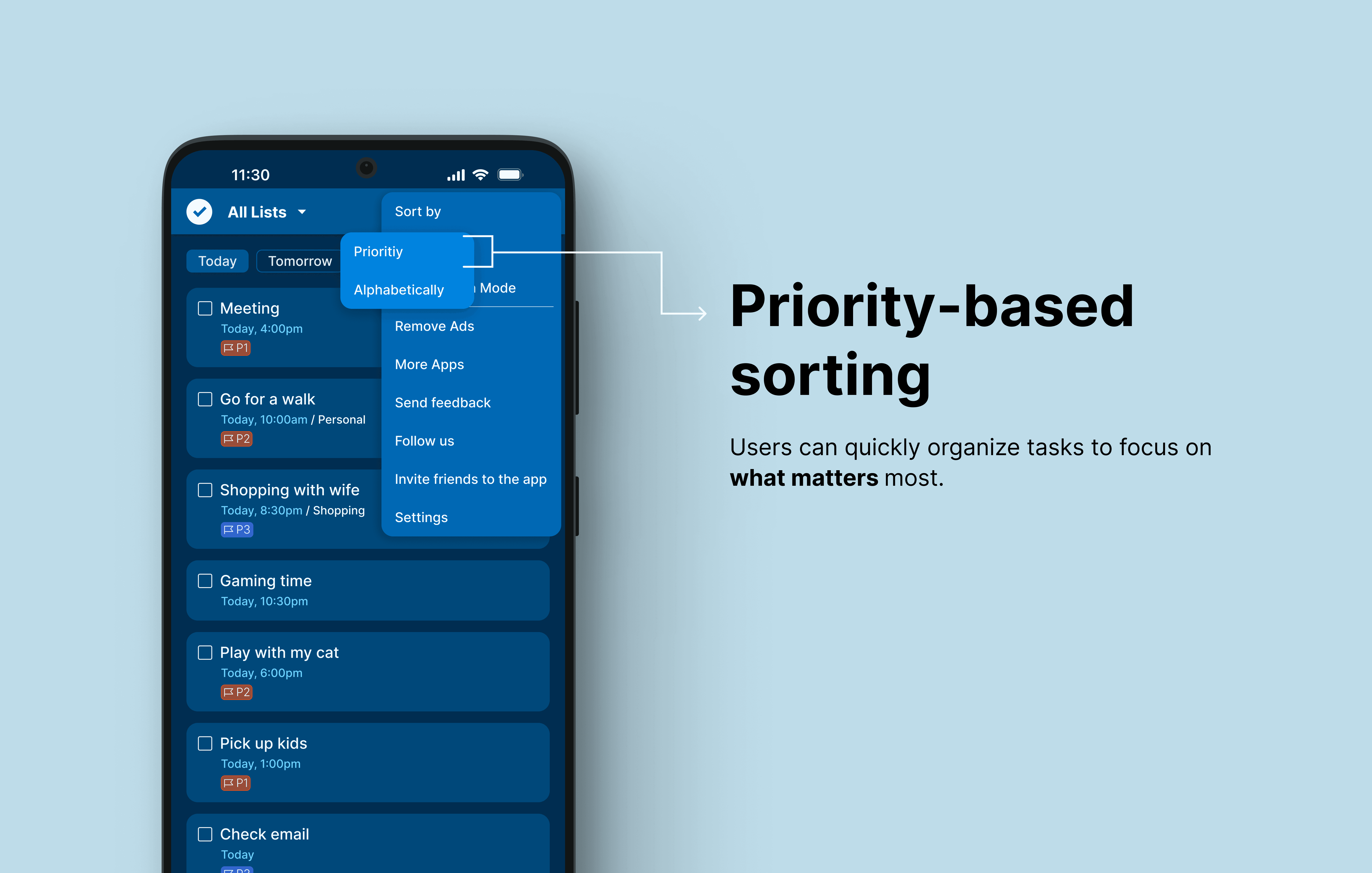
I redesigned the task flow to help users focus on meaningful work instead of managing long lists.
💡 The solution introduces priority at the moment of task creation, surfaces only relevant tasks for the day, and allows users to sort tasks based on importance to reduce overwhelm and improve focus.
I redesigned the task flow to help users focus on meaningful work instead of managing long lists.
💡 The solution introduces priority at the moment of task creation, surfaces only relevant tasks for the day, and allows users to sort tasks based on importance to reduce overwhelm and improve focus.



Process
Process
Process
This project followed a structured design process to identify user pain points and translate them into a practical solution.
Starting with user research, I explored how people manage tasks and where traditional to-do lists fail.
Based on insights, I defined the core problem, explored possible solutions through sketches and wireframes, and developed a prototype focused on priority-based task organization.
This project followed a structured design process to identify user pain points and translate them into a practical solution.
Starting with user research, I explored how people manage tasks and where traditional to-do lists fail.
Based on insights, I defined the core problem, explored possible solutions through sketches and wireframes, and developed a prototype focused on priority-based task organization.
👇🏻 Click to jump to the corresponding section
👇🏻 Click to jump to the corresponding section
👇🏻 Click to jump to the corresponding section
User Research
User Research
User Research
The goal of the research was to understand how users currently manage their daily tasks, what challenges they face with traditional to-do lists.
I conducted secondary research by analyzing productivity articles and user experiences related to task management.
This helped identify common behavior patterns and pain points users face when using traditional to-do lists.
The goal of the research was to understand how users currently manage their daily tasks, what challenges they face with traditional to-do lists.
I conducted secondary research by analyzing productivity articles and user experiences related to task management.
This helped identify common behavior patterns and pain points users face when using traditional to-do lists.
-> Article Review Insight 1 :
-> Article Review Insight 1 :
-> Article Review Insight 1 :


Key findings :
Key findings :
Key findings :
Users often complete low-impact tasks to feel productive while avoiding high-impact work.
The user thinks he did well, but he actually kept busy with low-impact tasks
Users often complete low-impact tasks to feel productive while avoiding high-impact work.
The user thinks he did well, but he actually kept busy with low-impact tasks
-> Article Review Insight 2:
-> Article Review Insight 2:
-> Article Review Insight 2:


Key findings :
Key findings :
Key findings :
Feels overwhelmed by long task lists
Struggles to prioritize important tasks
Wants meaningful productivity, not just busyness
Feels overwhelmed by long task lists
Struggles to prioritize important tasks
Wants meaningful productivity, not just busyness
WireFrames
WireFrames
WireFrames
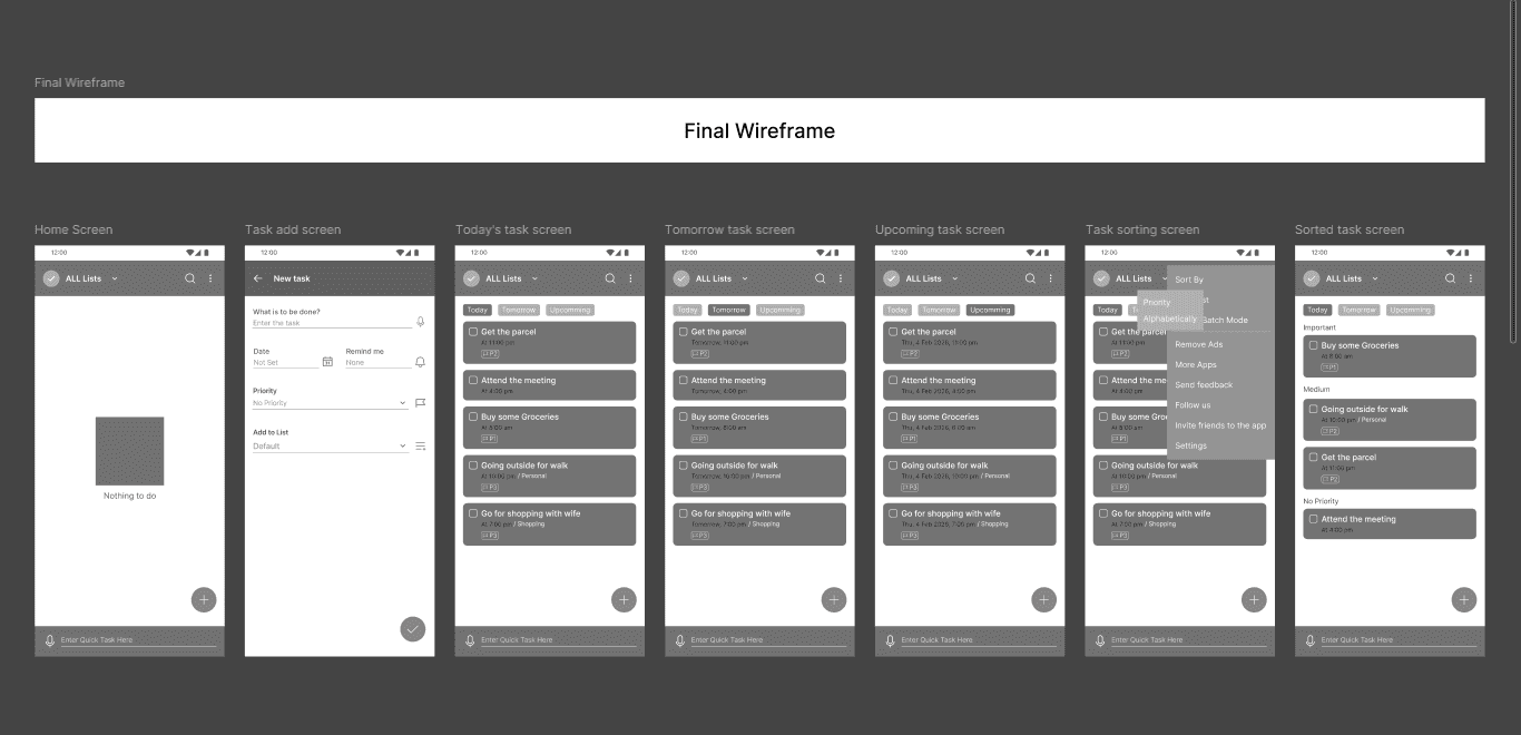
I created low-fidelity wireframes to test different ways of showing tasks and priority. The goal was to reduce overwhelm and help users quickly understand what to focus on.
After exploring multiple layouts, I selected a structure that keeps the interface simple while clearly surfacing important tasks.
There were lot’s of wireframes but here i showed the final ones.
I created low-fidelity wireframes to test different ways of showing tasks and priority. The goal was to reduce overwhelm and help users quickly understand what to focus on.
After exploring multiple layouts, I selected a structure that keeps the interface simple while clearly surfacing important tasks.
There were lot’s of wireframes but here i showed the final ones.

Style guide
Style guide
Style guide
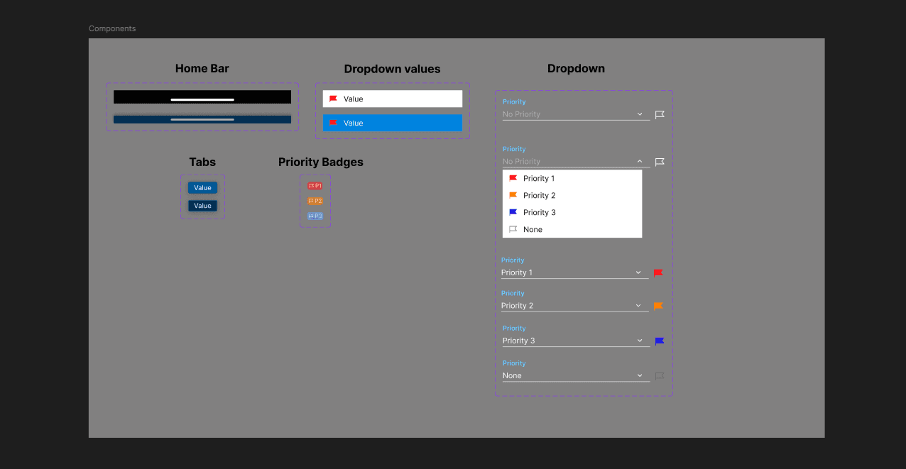
Before creating the final UI, I defined basic styles and reusable components to keep the design consistent.
Instead of choosing random styles, I built them based on the visual direction of the app. This helped maintain clarity, reduce repetition, and speed up the design process.
Before creating the final UI, I defined basic styles and reusable components to keep the design consistent.
Instead of choosing random styles, I built them based on the visual direction of the app. This helped maintain clarity, reduce repetition, and speed up the design process.

Major Design Iteration
Major Design Iteration
Major Design Iteration
Iteration 1
Iteration 1
Iteration 1
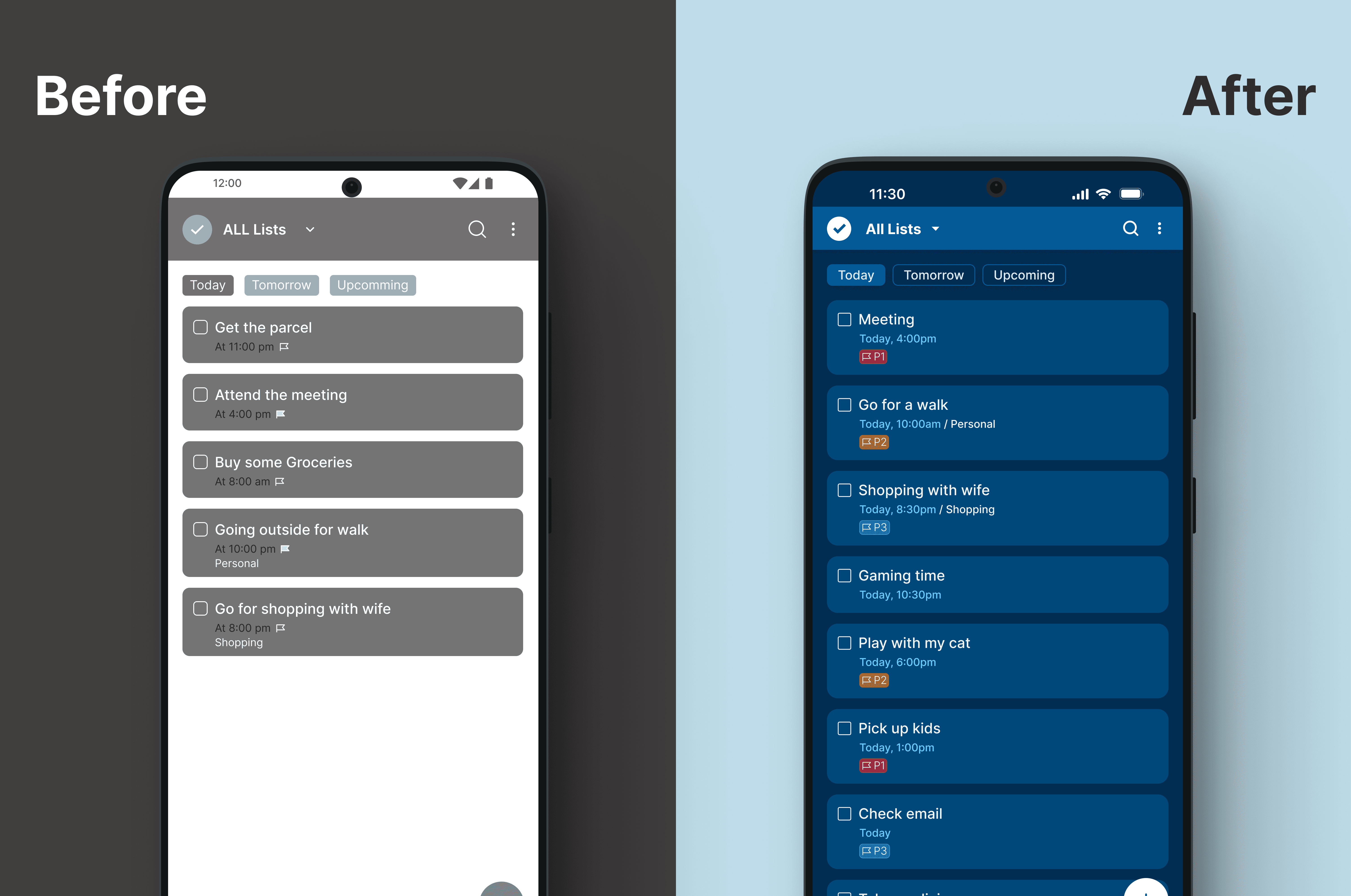
Initial wireframes used a flag icon to represent task priority. During design review, this raised concerns about ambiguity, as the icon could be mistaken for bookmarking or saving. It also created a small tap area on mobile.
After evaluating alternative patterns, I replaced the icon with a text-based priority badge.
This change improves clarity, reduces misinterpretation, and makes important tasks easier to identify at a glance.
Initial wireframes used a flag icon to represent task priority. During design review, this raised concerns about ambiguity, as the icon could be mistaken for bookmarking or saving. It also created a small tap area on mobile.
After evaluating alternative patterns, I replaced the icon with a text-based priority badge.
This change improves clarity, reduces misinterpretation, and makes important tasks easier to identify at a glance.
Iteration 2
Iteration 2
Iteration 2

During early exploration, priority options were presented using text-heavy labels such as “P1 – High Priority.” This created visual noise and increased cognitive load during task creation.
To improve clarity and speed of selection, I simplified the options into a cleaner priority system with visual indicators and a “No Priority” state.
This makes the selection easier to scan and aligns the input pattern with how priority is displayed on task cards.
During early exploration, priority options were presented using text-heavy labels such as “P1 – High Priority.” This created visual noise and increased cognitive load during task creation.
To improve clarity and speed of selection, I simplified the options into a cleaner priority system with visual indicators and a “No Priority” state.
This makes the selection easier to scan and aligns the input pattern with how priority is displayed on task cards.
Iteration 3
Iteration 3
Iteration 3
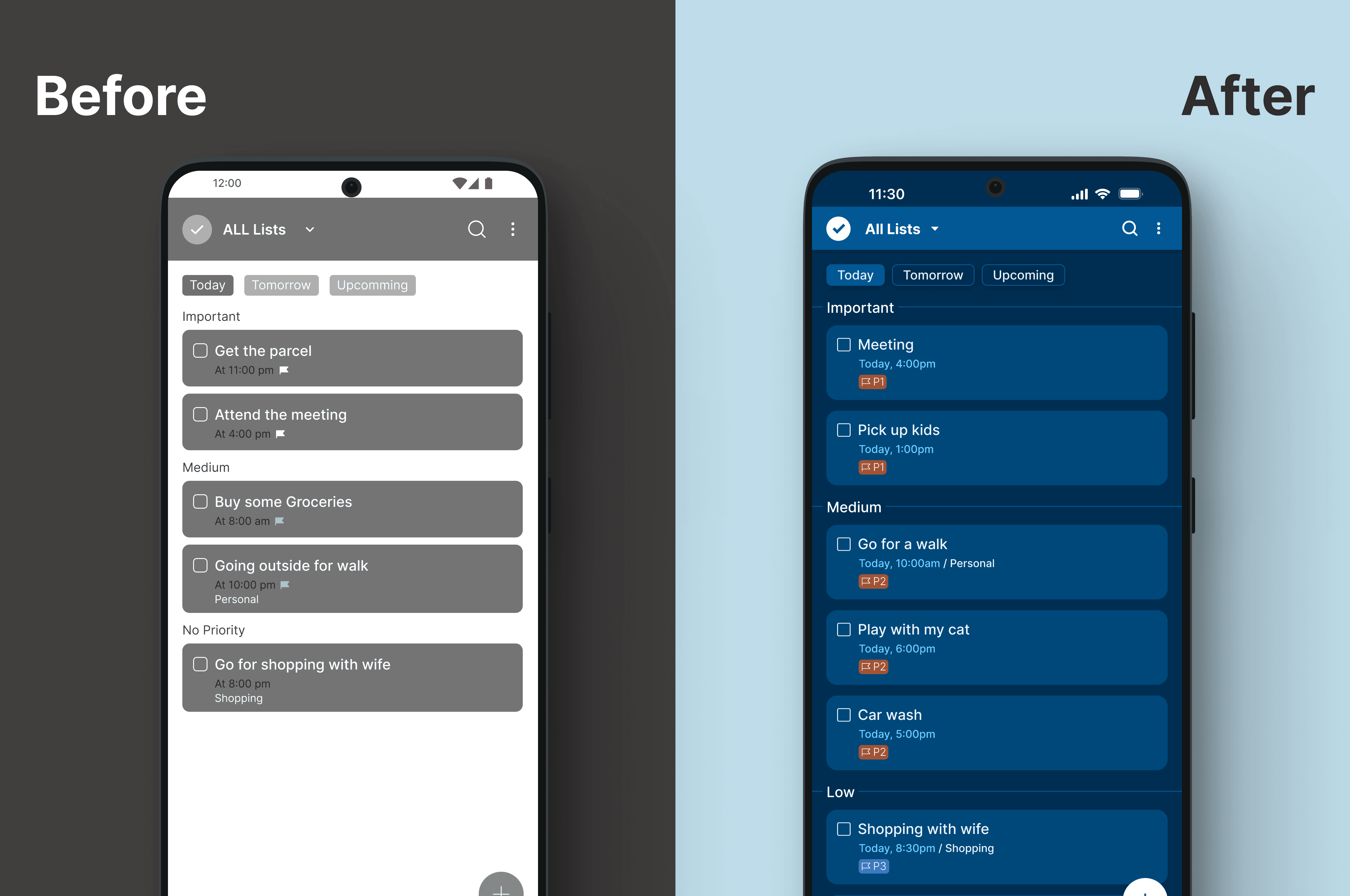
In the wireframe, tasks were grouped by priority but lacked clear visual separation, making sections feel visually merged and harder to scan.
So I introduced subtle divider lines between priority sections (High, Medium, Low) to improve structure and readability. This creates a clearer visual hierarchy and helps users quickly understand task grouping without increasing visual clutter.
Users can scan and interpret task sections faster, especially when multiple tasks are present.
In the wireframe, tasks were grouped by priority but lacked clear visual separation, making sections feel visually merged and harder to scan.
So I introduced subtle divider lines between priority sections (High, Medium, Low) to improve structure and readability. This creates a clearer visual hierarchy and helps users quickly understand task grouping without increasing visual clutter.
Users can scan and interpret task sections faster, especially when multiple tasks are present.
Final Design
Final Design
Final Design




Expected Impact ✨
Expected Impact ✨
Expected Impact ✨
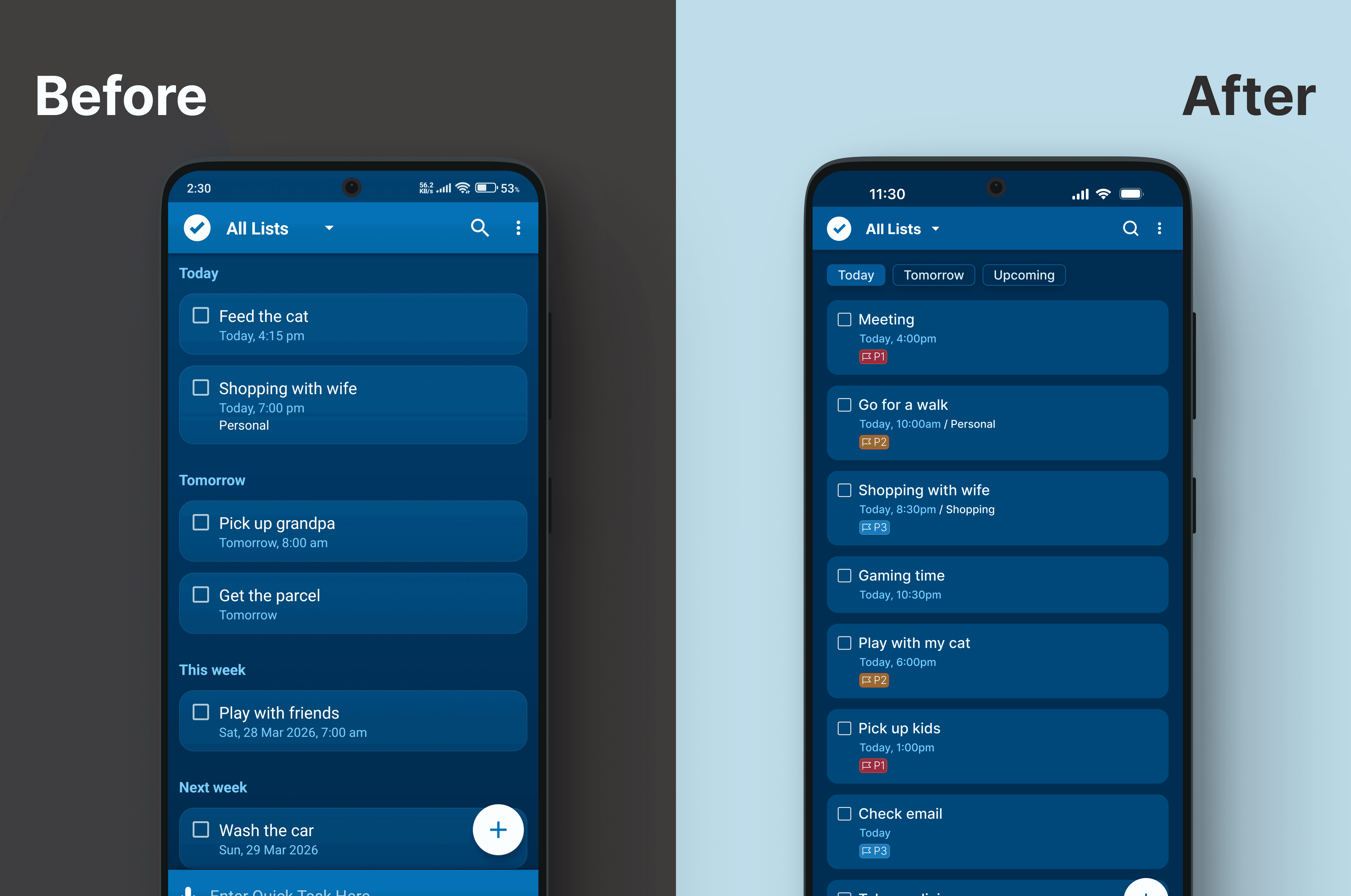
This design addresses the difficulty users face in identifying important tasks within long to-do lists. With priority visibility, sorting functionality, and clearer grouping, users can better organize their work and focus on what matters most.
This design addresses the difficulty users face in identifying important tasks within long to-do lists. With priority visibility, sorting functionality, and clearer grouping, users can better organize their work and focus on what matters most.
What I learned 🌱
What I learned 🌱
What I learned 🌱
I learned that jumping directly into screens without clear reasoning can lead to solutions that don’t address real user needs.
I learned that the first wireframe is only a starting point. Iteration is a natural and necessary part of the design process, and improvements should be guided by feedback
I also learned that redesign decisions should be based on clarity and user value, not personal preference. Every change should have a purpose.
Through research, I understood that users often struggle with prioritizing tasks, which leads to low-impact work being completed first. This insight directly shaped the final design solution.
I understood the role of prioritization in reducing cognitive load.
I learned that jumping directly into screens without clear reasoning can lead to solutions that don’t address real user needs.
I learned that the first wireframe is only a starting point. Iteration is a natural and necessary part of the design process, and improvements should be guided by feedback
I also learned that redesign decisions should be based on clarity and user value, not personal preference. Every change should have a purpose.
Through research, I understood that users often struggle with prioritizing tasks, which leads to low-impact work being completed first. This insight directly shaped the final design solution.
I understood the role of prioritization in reducing cognitive load.